In my previous post, I explained the genesis of this analysis and the steps required to obtain the raw data. I aimed to create a geospatial map to visualize Grand Rapids’ tax revenues per acre. To do this, I calculated the “Value per Acre” (VPA) of each of GR’s ≈ 65k property parcels by dividing the potential property tax by its acreage. The VPA tells us how many dollars of tax revenue the city can derive from each acre within the city boundaries. Dividing each parcel by its acreage normalizes the property tax which allows us to compare parcels of different sizes.
I first separated the parcels with an assessed value of 0 and labeled them tax-exempt (light red on the map). These compose 4.5% of total parcels but take up 27% of the entire area of the city! They’re mostly made up of things like churches, schools, colleges, cemeteries, landbank-owned properties, parks, and other city-owned properties. (2912 parcels with acreage of 7923.)
I then split the remaining parcels into quartiles and color-coded them with the first quartile starting as a very light blue and each incremental group getting progressively darker. This means that each color “class” contains 25% of all non-tax-exempt parcels (15,661 per class). Value Per Acre in Grand Rapids, MI
2/6/24: The published maps omit a few important steps on my VPA calculation. I took the 2023 Assessed Value of each parcel, divided it by 1000, multiplied that by the annual millage rate applicable to that parcel by its school district (table added at the end for reference), multiplied that by 1.01 to add in the 1% Admin Fee, and then divided that by (cleaned) acres. My apologies for the omission.
Here’s a link to the (91 MB) high-resolution map. I’d recommend right-clicking on the link and choosing “Save Link As…”. It’s easier to zoom in on your computer than in your browser.
Interesting Insights and Questions
- Our dense Downtown subsidizes everything else, but especially those parcels on the perimeter. This makes sense intuitively because it’s the only place highrises are allowed. When you stack 34 floors onto one parcel, it’s natural that the tax values extracted will be high. When you limit the height to 2 stories in most residential neighborhoods, getting many units is impossible. Allowing taller buildings by right will increase our tax base and simultaneously provide desperately needed housing supply.
- Traditional Neighborhoods (TN) subsidize Mid-20th Century (MCN) and Modern Era Neighborhoods (MON). You can’t see this on the map above because I don’t have access to the GR zoning shapefiles, but I included an image below which shows them separately. TNs are near the core and the others the periphery. You can download the official PDF here. TNs were developed before society’s dependence on the automobile. MCNs were developed after WW2 as America shifted to an automobile-dependent development pattern. MONs were developed to serve individual uses and connectivity is less evident; they often have no sidewalks and are only connected to other uses by major roadways. You can read more about the neighborhood classifications in the GR Zoning Ordinance. If the goal of the city is to remain strong financially, we should be encouraging and incentivizing more traditional development patterns that do not prioritize cars. Alternatively, we could increase taxes on non-TN neighborhoods, but good luck getting voters (who are disproportionately homeowners) to vote “yes” to higher taxes. 😂
GR Zoning Map
- The contrast between neighborhoods across some streets is stark: for instance, Plainfield intersects the North End neighborhood. To the west is Riverside Gardens within the Creston neighborhood. To the east is Chesire which has much smaller lots and a traditional grid pattern for its lots. Riverside Gardens incorporates more curves and has a lot more space. It’s also generating a lot less income on a per-acre basis as seen by lower VPAs.
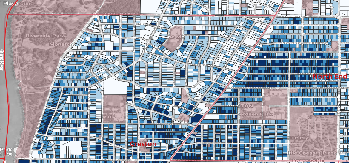
The Plainfield Split
Smaller lots tend to have a higher VPA; larger lots tend to have a lower VPA. Does a tax system where the poor subsidize the wealthy sound like a society in which you want to live? Some argue in favor of taxing land regardless of buildings by using a land value tax (LVT). I haven’t yet done enough research to figure out if that’s something I support. But lowering or removing greenspace requirements, setbacks, and height restrictions would lead to higher VPAs. - Our Historic Districts were largely built before zoning. The neighborhoods are dense. The builders of yore figured things out without needing a government checklist. As the city evolved, so did these neighborhoods; old mansions of the lumber barons were split into 2-6 apartments. Old carriage houses were converted to second units. People like living there because they’re walkable neighborhoods; local businesses thrive because the density allows sufficient customers that allow them to earn a profit. And the city revenue is high because of this density, desirability, and symbiotic economic activity. But then “we” made it illegal to continue building using this proven building pattern that worked well. I could opine about why I think that happened, but it’s not important; this VPA analysis shows that dense building patterns create walkable neighborhoods that are valuable to the city, so why don’t we allow more of it?
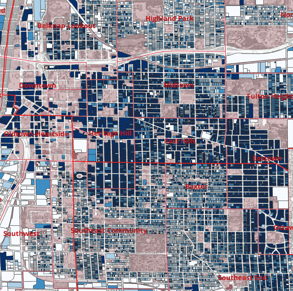
The Historic Districs
These districts also show the importance of allowing buildings to evolve as our needs change. Flexible, adaptive zoning “future-proofs” our city. Restrictive zoning locks in problems and forces future generations to pay for the unintended consequences. If our previous zoning code hadn’t made it illegal to build anything other than single-family homes (the most expensive, least-efficient type of homes) on 75% of our lots, would we even have experienced a housing shortage? - I mentioned the 7923 acres (27% of the entire city) of tax-exempt properties. With a city-wide average of $25,408 tax VPA, the forgone taxes on those properties amount to $201,311,443! But these tax-exempt properties lie in different parts of our city and as you can see below, different neighborhoods have different average VPAs. The Downtown has the highest one and 60% of all properties there are tax-exempt. If I multiply the tax-exempt acres by each neighborhood’s average VPA that number increases to $238,249,293 —almost another $37 million! Parks and libraries are necessary and important, but what’s the right balance between taxable and tax-exempt properties? Does this opportunity cost get added in when planning new mega projects like the Acrisure Amphitheater or the planned soccer stadium? Alternatively, maybe the high VPA for these neighborhoods is somewhat due to the benefits these tax-exempt properties generate?
What other insights did I miss? What else do you wonder?
Value Per Acre by Neighborhood
I calculated VPA by neighborhood to see how they compared. This table only includes taxable parcels which is why some of the neighborhoods may seem smaller than you’d think. The percentage of each neighborhood that is tax-exempt spans the gambit from just 6% in Eastern-Burton to the order-of-magnitude higher Oldtown-Heartside at 63%.
| Neighborhood | Acres (Cleaned) | Annual Taxes w/ No PRE (AV) $ | Value Per Acre (AV) $ |
|---|---|---|---|
| Downtown | 48.3 | 25,850,271 | 535,223 |
| Oldtown-Heartside | 80.5 | 14,324,739 | 177,990 |
| Heritage Hill | 192.2 | 13,680,243 | 71,175 |
| Ottawa Hills | 44.8 | 2,990,053 | 66,810 |
| Midtown | 208.6 | 12,892,169 | 61,800 |
| East Hills | 157.9 | 9,639,828 | 61,058 |
| Belknap Lookout | 220.3 | 11,605,521 | 52,673 |
| Eastown | 237.5 | 11,615,375 | 48,909 |
| Fulton Heights | 134.1 | 5,398,619 | 40,270 |
| Eastgate | 147.3 | 5,668,413 | 38,480 |
| Baxter | 104.7 | 3,881,552 | 37,071 |
| Southeast End | 536.0 | 19,670,432 | 36,699 |
| Alger Heights | 287.2 | 10,003,088 | 34,832 |
| West Grand | 1,021.3 | 33,211,248 | 32,518 |
| Southeast Community | 346.1 | 11,229,658 | 32,449 |
| Eastern-Burton | 65.3 | 1,958,129 | 29,994 |
| Garfield Park | 901.2 | 26,243,165 | 29,121 |
| Ridgemoor Park | 737.7 | 21,152,388 | 28,674 |
| Shawnee Park | 413.5 | 11,640,752 | 28,151 |
| Creston | 1,103.0 | 30,646,715 | 27,785 |
| Highland Park | 237.6 | 6,557,751 | 27,604 |
| Lake Eastbrook | 563.6 | 14,183,604 | 25,167 |
| Roosevelt Park | 172.8 | 3,965,518 | 22,946 |
| Southwest | 199.7 | 4,413,800 | 22,101 |
| Millbank | 647.5 | 13,862,418 | 21,408 |
| Leffingwell-Twin Lakes | 581.1 | 11,947,297 | 20,561 |
| Grandville | 152.4 | 3,090,562 | 20,282 |
| John Ball Park | 1,383.5 | 27,515,524 | 19,888 |
| ken-O-Sha Park | 870.1 | 16,203,343 | 18,623 |
| Shangrai-La | 224.7 | 4,011,835 | 17,850 |
| Northeast | 1,453.4 | 24,050,357 | 16,548 |
| North End | 1,468.4 | 24,031,651 | 16,365 |
| North Park | 668.2 | 10,380,011 | 15,535 |
| Michigan Oaks | 869.5 | 13,308,542 | 15,306 |
| Shawmut Hills | 1,881.5 | 28,015,233 | 14,890 |
| Richmond-Oakleigh | 1,297.7 | 16,174,963 | 12,465 |
| Seeds of Promise | 1.7 | 15,856 | 9,228 |
| Black Hills | 324.9 | 2,772,732 | 8,534 |
| Grand Total | 19,985.6 | 507,803,356 | 25,408 |
It would be smart to compare GR’s total property tax income to the $507,803,356 that I calculated. My number should be higher since it’s using assessed value instead of taxable value, and it’s ignoring PREs. I don’t have a good source for this, but it may be available in a published City budget and would be a good validation that I didn’t make any errors in my analysis.
The Basics of Property Taxes
To determine one’s property taxes, the following steps are performed:
- Divide the taxable value of the property by 1000. These are the number of “mills” your house is valued at for property tax purposes. It’s easy to remember if you recall that a millimeter is equal to 1/1000 of a meter.
- Determine whether you qualify for a principal resident exemption (PRE). If you live in the property, Michigan exempts you from paying the first 18 mills of school operating millages. If you own a duplex and live in one of the two units, your PRE will be 50% instead of 100%.
- Determine your millage rates: the amount of property taxes you pay for each mill your property is worth.
- Multiply your mills by your millage rate.
Simplifying Assumptions
Two important numbers the City Assessor determines each year for each property are:
- Assessed value (AV): this is supposed to be 50% of the market value of the property. It’s typically synonymous with the State Equalized Value (SEV).
- Taxable Value (TV): on March 15, 1994, Michigan voters approved the constitutional amendment known as Proposal “A”. Before this, property tax calculations were based on Assessed Value. If a property’s value increased 20% in one year, the property taxes would also increase by 20%. Given voters’ disdain towards massive increases, Proposal “A” capped the annual increase at the inflation rate or 5% whichever was less.
When a property sale occurs, it is “uncapped” meaning the TV is reset to the AV. If the sale price was greater than two times the AV, the AV might jump too. Because the AV typically grows faster than the TV, long-term owners get a break on taxes when compared to what a new owner would pay. This incentivizes owners not to sell their properties.
I made two simplifying assumptions in my analysis. Reasonable people may disagree. I’m not even 100% confident I made the right calls. ¯\_(ツ)_/¯ Feel free to let me know what you think I could have done differently as I welcome constructive criticism.
Here’s what I assumed:
- PREs do not exist.
- All properties are taxed at their accessed value instead of their taxable value.
And here’s why I assumed those things:
The easy reason for assuming PREs don’t exist is the source I pulled the data from did not have this information. Even if it did, I don’t think the additional noise it would add to the visual would be useful. Because I find it illogical that homeowners (the people most likely to have children and use the schools) do not pay taxes to support their schools, I consider it to be a tax break gifted to homeowners instead of determining the underlying value of the real estate. If that person rented out the property, the PRE exemption would be removed, and suddenly the property value would jump because a rental is worth more tax dollars to the city than a unit occupied by a homeowner. This just makes the analysis more complex and noisy, so I ignored it to keep things simple.
My first version used the taxable value which made the map nosier. The Assessor’s Office releases an annual report (page 9 for 2023) that compares assessed values to taxable values to determine the loss in the property tax base due to Proposal “A”. For 2023, the SEV for real property was $9,481,883,800 while the TV was $6,390,907,984. This $3.091 billion gap is the highest it has ever been because property values skyrocketed in the last few years. It’s another reason it is fiscally irresponsible for a city to artificially suppress the construction of new housing since they’re not able to capture appreciating property values through taxes when it exceeds 5%. Better to have more properties appreciating slower to grow a city’s tax base.
Eliminating the noise introduced by these two little “tax breaks” results in a more pure analysis of the city’s VPA with less parcel-by-parcel variation and more consistent neighborhood groupings.
This last issue is less a simplifying assumption and more of an “I just ignored it”. To get an even better analysis, we could take the taxes each parcel generates and subtract the costs the city spends to provide services to that parcel. When consulting firms have done this in the past, they usually find that single-family homes cost cities money and dense projects net the city money. An important yet difficult-to-calculate number needed to perform this math is the cost for a city to provide infrastructure services to each parcel. Some sources recommend using $6000, but the “right” answer is very difficult/impossible to calculate since city budgets aren’t determined on a per-parcel basis. But we do know the driver of sewer and water line costs are linear feet. Parcels closer to the water treatment plant are less costly to serve. And 100 linear feet might be enough to service a 50-story high-rise while only serving one or two properties in an area made up of single-family homes. The math for paving and plowing roads is similar. The City Engineer could spend some time calculating a good number, but it’s beyond my resources. The analysis of the revenue side of the equation already clearly shows that many of the relatively less dense light-colored parcels are being subsidized by relatively denser blue parcels.
Data Cleaning and Validation
When I first ran the calculations, I realized that something was wrong with condominiums: each site condo had the full acreage listed as its own. So if there were 10 condos on 1 acre, each of those 10 condos claimed 1 acre as its own instead of only being 1/10th. The best way to handle this would have been a script that looked for an indicator that a parcel was part of a condominium, determined how many units were in the condominium, and then divided the total acreage by the number of units. But the only indication that a property is a condo is in the legal description and they don’t all follow the same convention. So instead, I made one more simplifying assumption (introducing a possible source of error); I wrote a Python script that sorted all properties by their acreage and then went through each one and compared it to the next one. If it was the same, I started counting each one until it came to one that wasn’t the same. Then I divided the total acreage by the number of units that had the same acreage. Acreage was listed out 8 decimal points, so I feel this was fairly safe. Still, it is possible I inaccurately attributed a property that was not part of a condominium to it if it had the same acreage out to 8 decimal points. I don’t have a great way to test for this error, so just another grain of salt with which to take this analysis.
I started with all the properties listed in the Kent County Parcel Data, but the parcel count was 100,319 which is about 35k more than GR has. When I mapped the data, it stretched beyond Grand Rapids, but oddly did NOT appear to contain all parcels in Kent County, so the name was a bit of a misnomer. I used the Grand Rapids boundary map to “stamp out” just those parcels that were contained within its boundaries. I’m not an expert in QGIS, so I’m not 100% sure I did this correctly: you can choose different options for how the “stamp” should work. For instance, if the GR Boundaries intersect a parcel, should that be included or excluded? To be 100% accurate, you’d want to start with a list of all the parcels from the Assessor’s Office, but since they won’t release that information without a $650 fee and consider it exempt from FOIA, I got as close as I could. This “stamp” left me with 65,560 parcels. According to the 2023 Assessors Report, there were 64,109 parcels. So where did these extra 1451 parcels come from? 🤷♂️ It is possible for municipalities to create new parcels. I split 2 parcels into 4 during 2023. But it doesn’t feel reasonable to assume that this happened over 1000 times. Without the Assessor’s Office providing their “source-of-truth” records for comparison, I don’t have a good way to determine the cause of this discrepancy. It could be that around the border of the city, I included parcels that aren’t part of the city. Or a border shapefile didn’t align perfectly with the GR boundaries. It’s as close as a free analysis is going to get, so it’ll have to be enough.
According to the City’s Wikipedia page, the land in the city is 44.78 sq mi. Converted to acres (multiplied by 640), that’s 28,659 acres. When I sum up my parcel acres I’m at 19,986. Where are the other 8,673 acres? According to the GR Vital Streets Plan, there are 586 centerline miles of city-owned streets in the city. At Michigan’s statutory minimum road width of 66 feet, we get 4,688 acres. (586 miles x 5280 ft/mile x 66 feet ÷ 43,560 sq ft/acre) That leaves us with 3,985 extra acres. Throw in the alleys and non-city-owned roads like I-196 and US 131, and it seems reasonable to me. 🤷♂️
I needed to add acreage to the shapefiles. QGIS uses the WGS84 Geographic Coordinate System which means it’s measured in meters. I calculated the acres in the City of Grand Rapids City Limits shapefile using the Field Calculator and the formula $area / 4047 to convert from square meters to acres. This gave me 28,978 acres which is equal to 45.28 sq miles so very close to Wikipedia’s 45.63 sq miles.
I dropped one parcel from my analysis because the acreage was showing up as being less than 100 square feet for something on 28th Street. I suspect this was just an artifact or error in the data.
There’s a discrepancy between the GR City limits and the neighborhoods that make up that boundary. I mapped the City Limits in red and the Neighborhoods in green. You can see that they’re not quite aligned in John Ball Park, Ken-O-Sha Park, and then an unnamed neighborhood in between Ridgmoor and Lake Eastbrook.
It also looks like there may be some errors with some of the neighborhood boundaries.
- Seeds of Promise appears to be an overlay district consisting of parts of the Southeast Community and Garfield Park. It contains just under 1,400 acres.
- Ridgemoor Park appears to contain Ridgemoor.
- Millbrook Community Bridgeworks appears to be wholly contained within Millbank.
- There doesn’t appear to be a name for the neighborhood between Ridgemoor and Lake Eastbrook.
- There doesn’t appear to be a name for the neighborhood south of the Southeast Community and north of Garfield Park.
These details are difficult to see on such a small map, my apologies. You can explore some of these issues directly on the GRData’s website.
The only two I felt comfortable remapping were Millbrook Community Bridgeworks to Millbank because the first had 865 acres and the second had 864, and Ridgemoor -> Ridgemoor Park because when I added the neighborhood names to the parcels, it looked like it only stamped 2 parcels as belonging to Ridgemoor. The other issues still exist, I’m just not sure how to handle them.
Map of GR Neighboorhoods from their Shapefiles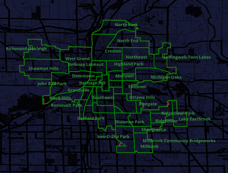
Total acres when split out by neighborhood is 30,363.87. Subtract the 1,400 “overlay district” of Seeds of Promise and we’re at 28,978 acres which is equal to the entire GR boundaries!
I then compared the parcel acreage by neighborhood to the total acreage of the boundaries of that neighborhood. On average, the ratio of parcel acreage to neighborhood acreage was 1.52. This makes sense because streets aren’t assigned a property parcel number and aren’t taxed, so the sum of the individual acres should always be smaller than the total neighborhood. This holds true everywhere except for the North End neighborhood where this ratio is 0.90. I cannot explain this discrepancy.
Further Analysis
- It would be interesting to have density data, but I’m not aware of this existing. How do single-family homes compare with duplexes?
- If the zoning shapefiles were made available, we could calculate the value per acre for each of them to quantify what we qualitatively observed from the map.
- If we had parcel width and depth, we might be able to see whether it contributed to VPA. However, since acreage is already a function of those two elements, we’d likely run into multicollinearity issues.
- I would be very interested in how GR’s tax-exempt property ratios compare to other cities, but I’m not sure this data is easily accessible.
- It would be cool to see the number of units at each address. The city’s official assessor data might have something in their ECF Neighborhood field. Otherwise, you’d probably need a dataset from the USPS. 🤔
- If the City Engineer calculated a cost per acre number by summing the cost of all city services provided and dividing it by either the total number of acres in the city OR the total number of non-tax-exempt acres in the city, we could look at per parcel profit vs. subsidy.
Thanks
Thanks to the StrongTowns GR group for looking over early maps and giving feedback and observations. The insight around the Plainfield divide came from them. Also, a shout-out to my friend and Econometrics Professor at GVSU Paul Isely for his recommendation to use the assessed value vs. taxable value in calculating VPA. As always, all errors and omissions remain my own.
Updates
Added 2/6/24: Because the printed maps omitted calling out a few important steps on the VPA calculations I performed, I added a note the day after originally posting with a warning note. I also wanted to include my source for obtaining the millage rates of each GR school district. The City has a Property Tax Estimator which allows you to put in a taxable value and your PRE % to show your millage rate. I used a 100k taxable value since the millage rates are uniform for all taxable values, but the calculator requires a number. I used a PRE of 0%. The calculator also shows the School Operating Tax mills broken out of the total. All school districts tax 18 mills on the tax bill for anyone without a PRE exemption except for Forest Hills which only charges 17.6614.
| School District | Area | Summer Mills | Winter Mills | Annual Mills |
|---|---|---|---|---|
| 41010 | Grand Rapids | 49.5741 | 1.9661 | 51.5402 |
| 41020 | Godwin | 50.8441 | 1.9661 | 52.8102 |
| 41050 | Caledonia | 52.7241 | 1.9661 | 54.6902 |
| 41110 | Forest Hills | 52.417 | 1.9661 | 54.3831 |
| 41130 | Grandville | 52.1262 | 1.9661 | 54.0923 |
| 41145 | Kenowa Hills | 50.3941 | 1.9661 | 52.3602 |
| 41160 | Kentwood | 51.2959 | 1.9661 | 53.2620 |
A friend who runs Grand Little Data Co suggested that the bin size for my final quartile spanning roughly $22 million may be a bit too wide. Especially when the other three are somewhere between ≈ 9k-25k. It is a fair critique. To figure out what else I might exclude or separate, I looked at the summary data by Property Classification Code. The following list contains all classification codes in the 2023 data, and you can see that properties classified as Commercial Condominiums contain the highest VPA. It also makes sense that most of those tend to be located in the Downtown and Heartside neighborhoods, so it might be reasonable to separate those into their own class and recalculate the quartiles for the remaining parcels. However, if we go down that path, why wouldn’t we also include only residential property classes instead of also including the commercial and industrial areas? When looking at the summary data by property class, the $369k VPA for Commercial Condominiums is large but is nowhere close to the largest VPA of $22,031,978, so there must be another explanation.
| Class Code | Prop Class Name | Acres (Cleaned) | Annual Taxes w/ No PRE (AV) $ | Value Per Acre (AV) $ |
|---|---|---|---|---|
| 207 | Commercial Condominiums | 26 | 9,595,899 | 368,625 |
| 407 | Residential Condominiums | 636 | 30,040,865 | 47,239 |
| 201 | Commercial-Improved | 4,651 | 147,340,829 | 31,678 |
| 401 | Residential-Improved | 11,380 | 299,765,703 | 26,342 |
| 301 | Industrial-Improved | 1,205 | 18,483,568 | 15,340 |
| 001 | Retired Split / Combine | 1 | 19,195 | 14,832 |
| 202 | Commercial-Vacant | 376 | 1,262,872 | 3,358 |
| 402 | Residential-Vacant | 990 | 886,701 | 896 |
| 302 | Industrial-Vacant | 720 | 407,722 | 566 |
| Citywide Total | 19,986 | 507,803,356 | 25,408 |
What’s driving those enormously large VPAs? It’s mostly the high-rise condominiums in conjunction with my cleaning process for acres. The Riverhouse Condos represent much of it; there are 206 property parcels present at 335 Bridge Street and every single one of them has just under a half acre set as their acreage in the property tax record. Since they share this space, I divided 0.49134611 acres by 206 parcels giving each unit “cleaned acres” of just 0.002385175 which is ≈ 104 square feet. With such a tiny sliver of city land attributed to them (because they’re built on top of each other, up in the sky), their VPAs soar which proves that density is incredibly valuable to a city. Additionally, many of those condos are high-end with a combined assessed value of almost $55 million and an average assessed value of $267k.
I may still rerun the map for just residential properties, but as soon as you start stripping out high VPAs you start missing the entire point of this analysis which is that there are a few properties that heavily subsidize the rest. And with bin sizes greater than 15k, even stripping out a few hundred isn’t likely to reduce that much.
VPAs for all GR Parcels - Major Tick Marks Represent the 4 Bins